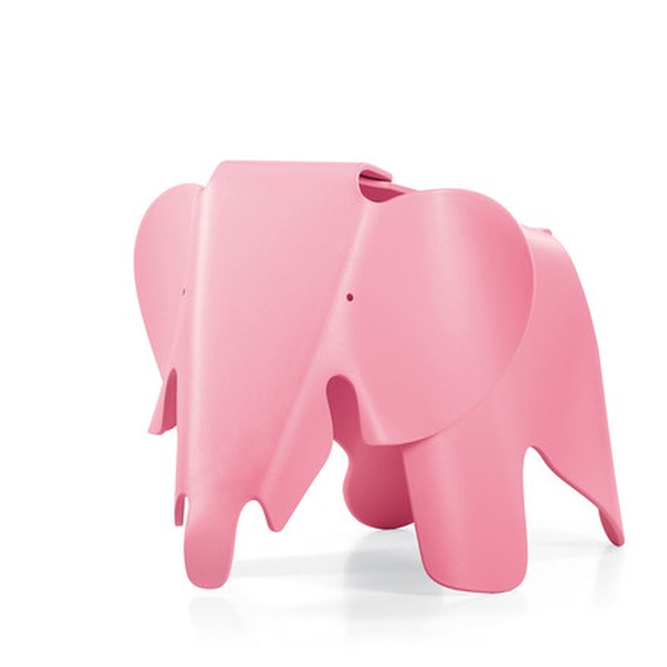
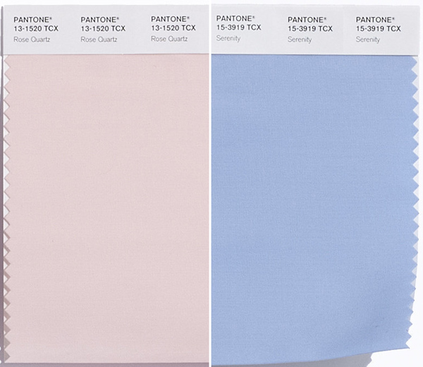
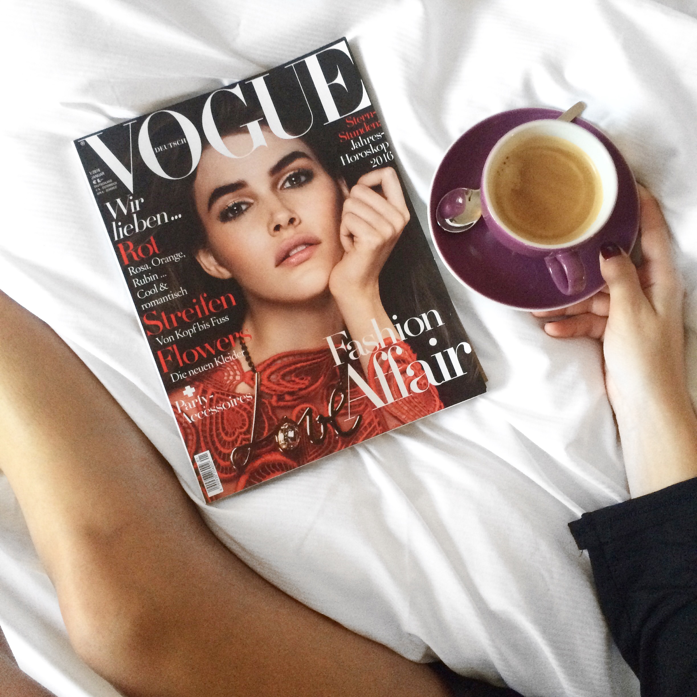
EN| No later than now, we should look around while deciding if we want to have „It´s a Girl!“ or „It´s a Boy“ written all over our apartments. Trendcolors of 2016 are Pantone „Rose Quartz“ and „Serenity“, both pastel colors in light rose and light blue. I actually love both colors and love it, that it looks very clean and light. You can combine both colors extremely good with copper or gold. So why not choosing now and getting something fresh for 2016? I picked some Pastel Favorites for you Which one is your fave? xx L.
DE| Spätestens jetzt, nachdem die Pantone „Rose Quartz“ und „Serenity“ zu DEN Trendfarben des Jahres 2016 gekürt wurden, wollen wir alle Pastelltöne in unserer Wohnung wiederfinden. Wir wollten uns jetzt also schonmal Gedanken machen, ob wir eher zu „It´s a Boy!“ oder „It´s a Girl“ tendieren und unsere Wohnung in Blassrosa oder doch lieber Hellblau dekorieren wollen. Ich selbst mag beide Farbtöne sehr gerne und auch andere Pastelltöne haben es mir angetan. Wieso also nicht einmal etwas wagen und ganz auf Farbe setzen? Ein paar tolle Inspirationen habe ich euch zusammengesucht. Welcher ist euer Favorit? xx Eure Laura


1 Kommentar
Echt schwierige Frage… ich finde beide wirklich hübsch 🙂 Speziell in Verbindung mit klassischen Pastellfarben wie Taupe kann ich mir da schon ein paar tolle Looks vorstellen 🙂
Liebe Grüße
Ina
http://www.ina-nuvo.com